A REFINED DESIGN TO SHOWCASE PRODUCTS & SERVICES
MOSCOW RETAIL TOUR
We no longer present the world’s No. 1 American fast-food chain with its distinctive yellow and red logo. Despite becoming the symbol of modern consumerism, the brand has been widely criticized. As a result, it has had to adapt and reinvent itself over the decades. A fine example of evolution that has become a source of inspiration for many retailers.
THE ENTRY ON THE SOVIET MARKET: A SIGN OF DETENTE BETWEEN EAST & WEST
As such, it became the first American company to set foot on Soviet soil in 1990. At the height of the Cold War, this introduction on the Russian market carried a message heavy with breasts. At the same time a precursor sign of the end of the war between the United States and the USSR, it was above all the confirmation of a brilliant success story for McDonald’s.
MCDONALD’S PUSHKIN SQUARE, ONE OF THE LARGEST IN THE WORLD
Thirty years later, the brand is one of the best known in the world, with a strong brand image and thousands of franchisees worldwide. The Moscow restaurant is one of the largest in the world. With a surface area of 1,087 sqm on 3 levels, the restaurant was given a new look for its 30th anniversary.
A RENOVATION TO ENHANCE THE IN-STORE EXPERIENCE, PRODUCTS AND SERVICES OF THE BRAND
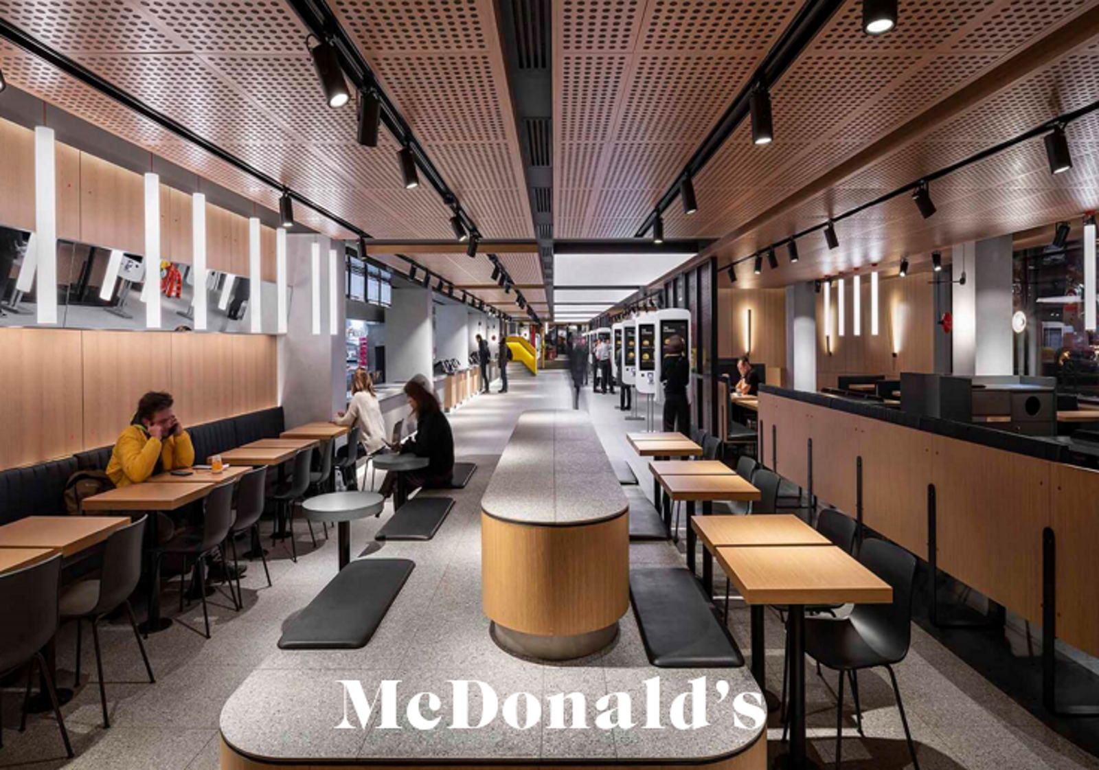
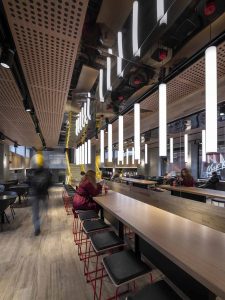
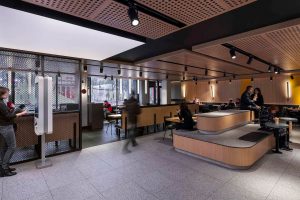
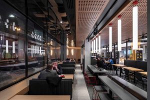
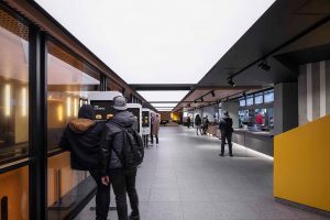
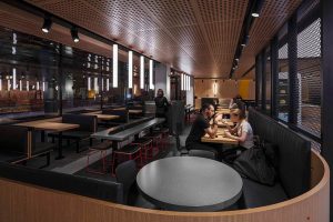
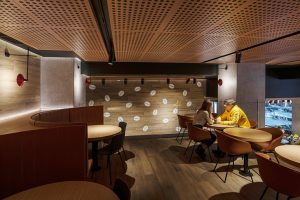
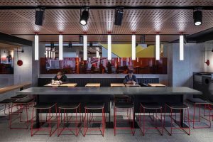
Renovated by the Landini Associates agency, the restaurant reopened in April 2020 under the “Project Ray” concept, as a tribute to the name of the founder of the brand. It respects the principles of “non-design”. It therefore highlights McDonald’s branded services and products while offering a quiet interlude for customers, far from the incessant din of Pushkin Square.
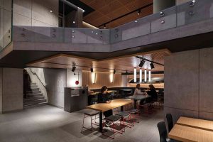
A REDESIGNED MERCHANDISING
For this purpose, the layout and seats were changed and then separated by screens to ensure maximum privacy. Some areas are even specially dedicated to groups.
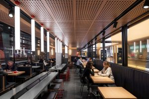
A CHOICE OF MATERIALS IN ACCORDANCE WITH THE PRINCIPLE OF “NON-DESIGN”
For the design of the restaurant’s interior, raw and pure materials such as concrete, stainless steel, oak and glass were chosen to create a form of “recognizable neutrality”. Only the large yellow M, emblematic of the sign, is discreetly painted on one of the walls. As for the way the concept works, it remains unchanged: touch-sensitive kiosks that allow customers to personalize and order their menu.
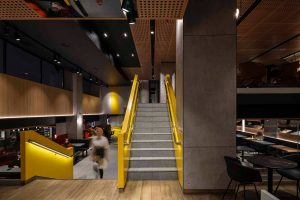
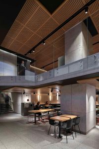
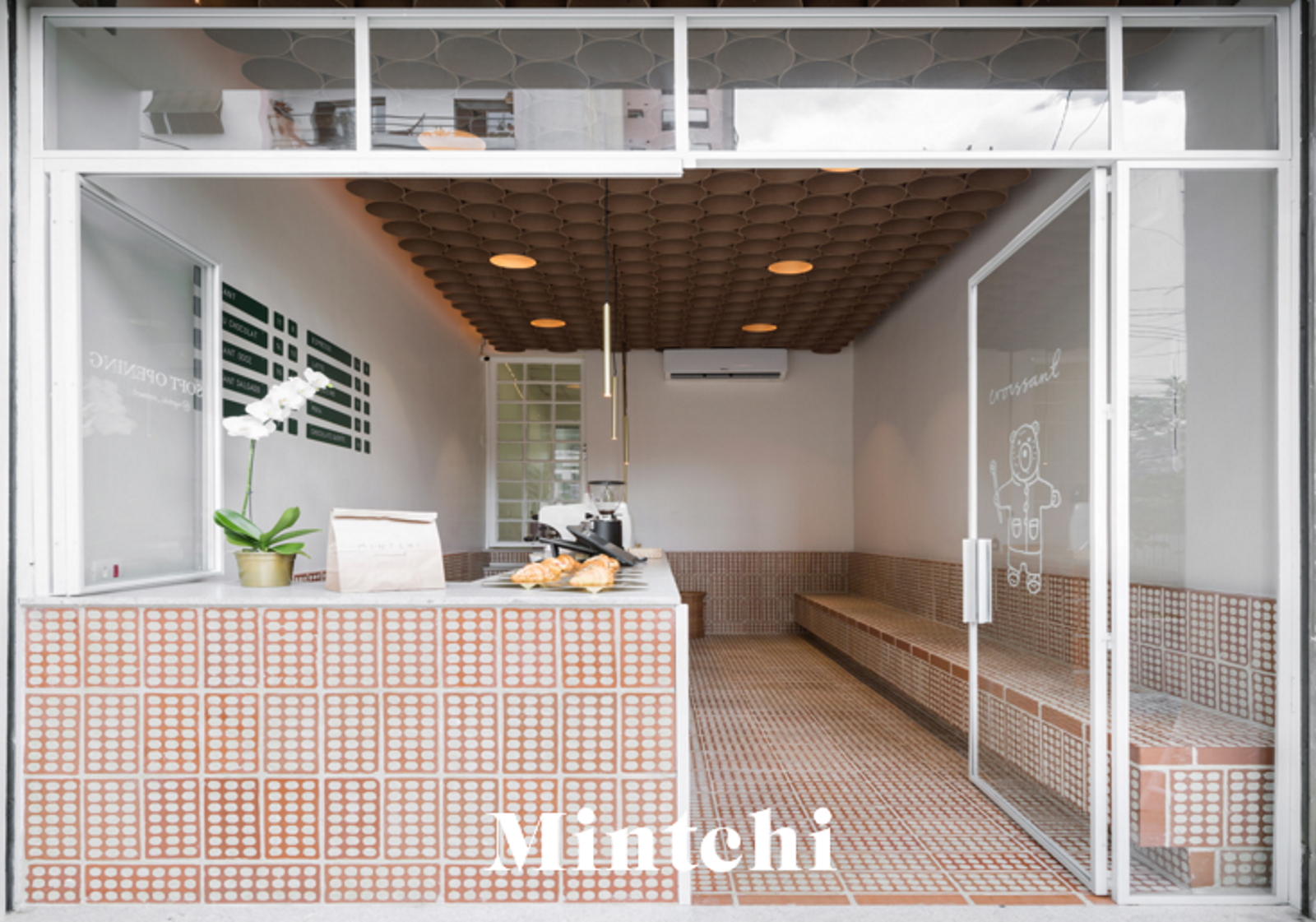
Another example where the sobriety of retail design serves as an ideal showcase to highlight the product, whatever it may be. In Brazil, the Mintchi bakery has used raw materials and clean design to highlight its flagship product: the croissant. The design is directly inspired by the star product, making it easily recognizable without overpowering the original concept.
Click on the image to discover the concept:
Every Friday directly in your mailbox, the retail news of the week, by subscribing to our newsletter


